Vital Intel.
Vital Intel was my first summer internship, and I am eternally grateful to be brought on as an amateur designer. I worked with Health Coach Institute (HCI), one of their clients, and I had three goals: learn and master graphic design software, develop the ability to adopt branding styles, and create compelling images that tell a story.
Master Graphic Design Software
Stay on Brand
Tell a Story
Prior, I had little to no experience designing and my biggest bragging rights were on how smooth I could draw a line in Microsoft Paint (I'm sure my mentor was really impressed). This summer I pushed myself to master Adobe Creative Cloud tools, and worked daily with Illustrator and InDesign, however my position as a 'design' intern was not a limiting factor to my exposure to other areas of the company. My key responsibilities as an intern involved creating marketing material for the sales team, researching and compiling competitor information for operations, and monitoring website functionality. Aside from those key points, I also acted as a full-time employee, taking on projects or supporting other team members to ease their workload which gave me invaluable immersion into the brand, and exposure to HCI student materials and PR packets.
Intern Projects
General Projects


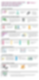
HCI Marketing Infograph.
My first project was to create an infograph marketing health coaching careers to potential health coach students. Despite the relatively simple request, it was something that I struggled with greatly. At the time I was still learning how to create graphics and I was unable to grasp the brand's design, and I was also at a loss to how much and what kind of information I should include in the page.
Research/Stats/Feedback
Drafts

I first scoured the HCI website for statistics on reasons to choose health coaching as a career that the PR and Marketing Directors believed to be important enough for us to showcase. From there, I got a taste of what type of numbers to look for while researching and also what kind of emotion I want those numbers to evoke. I compiled a list of statistics that I thought were valuable to include, and submitted them to my mentor to review. After receiving feedback, I further refined my results to push one narrative: the health industry is growing.
Now that I had content, I needed to figure a way to shove all that information onto an 8.5 X 11" paper without overwhelming the viewer (unfortunately a lot of this information needed text rather than a graphic to be understood). I prioritized information that I believed would be the concern of prospective health coaches: money, stability, and happiness. Keeping this in mind, I made the increase of money a centerpiece for the infograph, I wanted the audience to understand that health coaching is a plausible, good, and stable


profession to pursue. I also wanted urge prospective students to have a job that they truly enjoyed, and so I came up with the phrase "spark the change doing what you love" using the brand word "spark" and selective placement next to the HCI logo to hint at who you could go to, to start your new career. With these two areas taking on the brunt of prospective student concerns, the rest of the information served as a cherry on top to support the claims HCI was making.
I stumbled a lot when I first started adding more information into the graph, and you can see some of my progress in the drafts above. Unfortunately, you cannot see just how drastically different my first and final drafts were as I had deleted those files on accident. But trust me, my first draft flaunted various bubble graphs, lots of arrows, and a cream background...very far off from the HCI brand image. Thankfully I did improve, and my mentor gave me the go ahead to have my infograph published on the HCI website!

How HCI Sets You Up For Success Better Than The Rest
My second project was also a huge challenge for me as it was graphic heavy, but this also gave me the perfect opportunity to develop a rhythm to how I design, and for me to experiment with different tools. I think of this project as the pivotal moment where I was finally able to fully take on the HCI brand in my design and I managed to develop a style/format that helped me streamline my future work.


I first tried playing with line images and a lot of open white space because I was told that the brand was trying to become more sleek and modern, however I found out very quickly that I was mixing traditional line art with more complicated.detailed pieces. Learning from my inconsistency, I quickly determined that line images strayed too far away from how the current brand stood and pursued detailed graphics instead. I tried to choose colors similar to the Google design pallet and use simple shading methods. Soon after, I realized that my mentor was a fan of borders, but with so many lines already, I didn't want to throw more lines to frame the page, instead I chose to color the background, leading white along the edge instead. This brought the images together as a cohesive piece connected to each other rather than as independent floating images.


My mentor liked these grey drafts much better than my first tries, and quickly gave met he go ahead to finalize and turn in. With a few alignment tweaks, color adjustments, and title edits, my design was being rolled out to prospective students and investors. This project was the hardest for me to accomplish, but I am grateful for it because I learned how to utilize layering, combining/deleting overlay images, clipping masks, and got especially good at the pen tool.

Small Projects
From the theme I developed in my previous project, these projects came along far more smoothly, and were okay-ed after the first or second drafts! A lot of these projects I had to do a lot of research on, or are only allowed to be seen by paying students so unfortunately I am only allowed to include the covers I designed.